InDesign Introduction Training Course Example...
InDesign Training Example...
The InDesign Introduction Training Course has been designed with one objective in mind to let you hit the ground running and to start producing professional looking spreads/ layouts and documents from the start. As well as learning how to put together documents using grids, guides and styles good design practice is also adhered to in this course. It's no use just learning to create and publish documents without understanding how they work cosmetically. So we work with you to produce colour themes, font's and precise layouts.
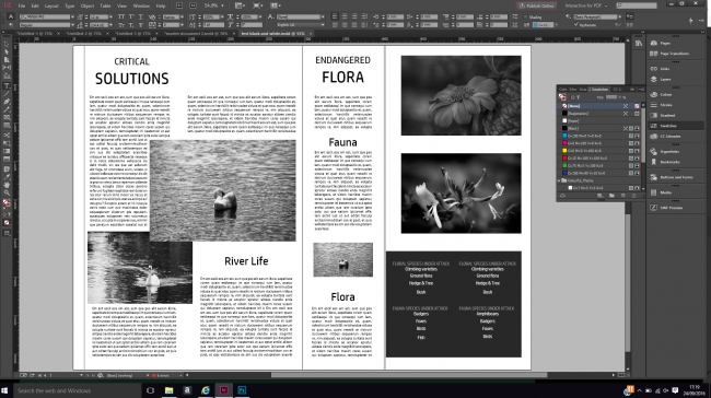
The design below is typical of the type of layout you would produce during the latter half of the InDesign Training course.

This was created and designed using the document grid for placement and a mix of text and image frames which the delegate wanted to have a blocky look - she was also keen to use a black and white colour scheme/
This type of layout is typical of the exercises we work on during the InDesign Training...


